Bringing A New Face To A Young Non Profit
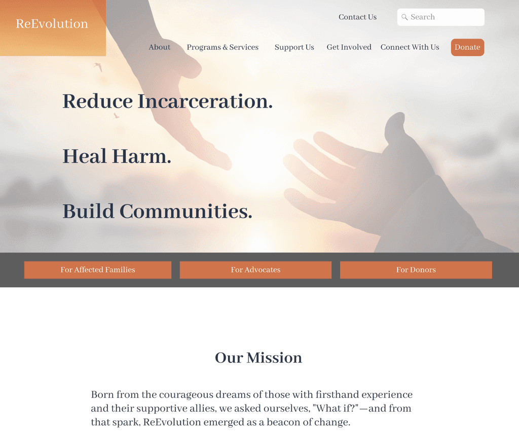
In this case study, I connected with community activists at Los Angeles based ReEvolution, to assist them in their mission, by redesigning their charity’s website.
Discover how I improved visual continuity, emphasized vital content to key user types and streamlined their use and engagement with such information.

MY CONTRIBUTIONS
User Research,
Design & Testing

TIMELINE
April 1-April 22 2024

THE TEAM
2 Designers working simultaneously
PHASE ONE
Overview
As part of the Northwestern Ux/Ui Bootcamp, we were tasked with the redesign of a nonprofit organization of our choosing. With just three weeks to conduct research, develop, test, create, iterate and summarize our design solutions, this redesign would test our ability to work cohesively and expeditiously as a team intent on producing a design that reflected the respect I have for the work being done by the organization.
For this case study, I connected with community activists at Los Angeles based ReEvolution, to assist them in their mission, by redesigning their charity’s website. Discover how I improved visual continuity, emphasized vital content to key user types and streamlined their use and engagement with such information.
ReEvolution is a Los Angeles based anti recidivism organization working to empower and heal, currently and recently incarcerated individuals and their families through programing and comprehensive services that aim to create an individualized framework of reentry built on community and restorative practices.

Constraints
Time constraints.
Limited resources.
Communication with the organization in order to best meet their vision and goals for a future platform redesign.
Given these challenges, we leveraged preliminary research of our competitors and a sample survey that we put together in order to understand the core needs of any non-profit site early on. This would allow us to lay a strong foundation of our redesign of a previously bare-bones site, allowing us more time in our iterative process to answer the question of what design choices can we make that would allow a deeper connection to ReEvolution’s mission and allow them to evolve as an organization.
California has an incarceration rate of 549 per 100,000 people ( this includes jails, prisons, juvenile and immigration detention facilities), one of the highest rates of any state in the U.S. Although trending downward, due to changes in law and municipal regulations on policing, the rate of reincarceration remains high.
PHASE TWO
Discovery
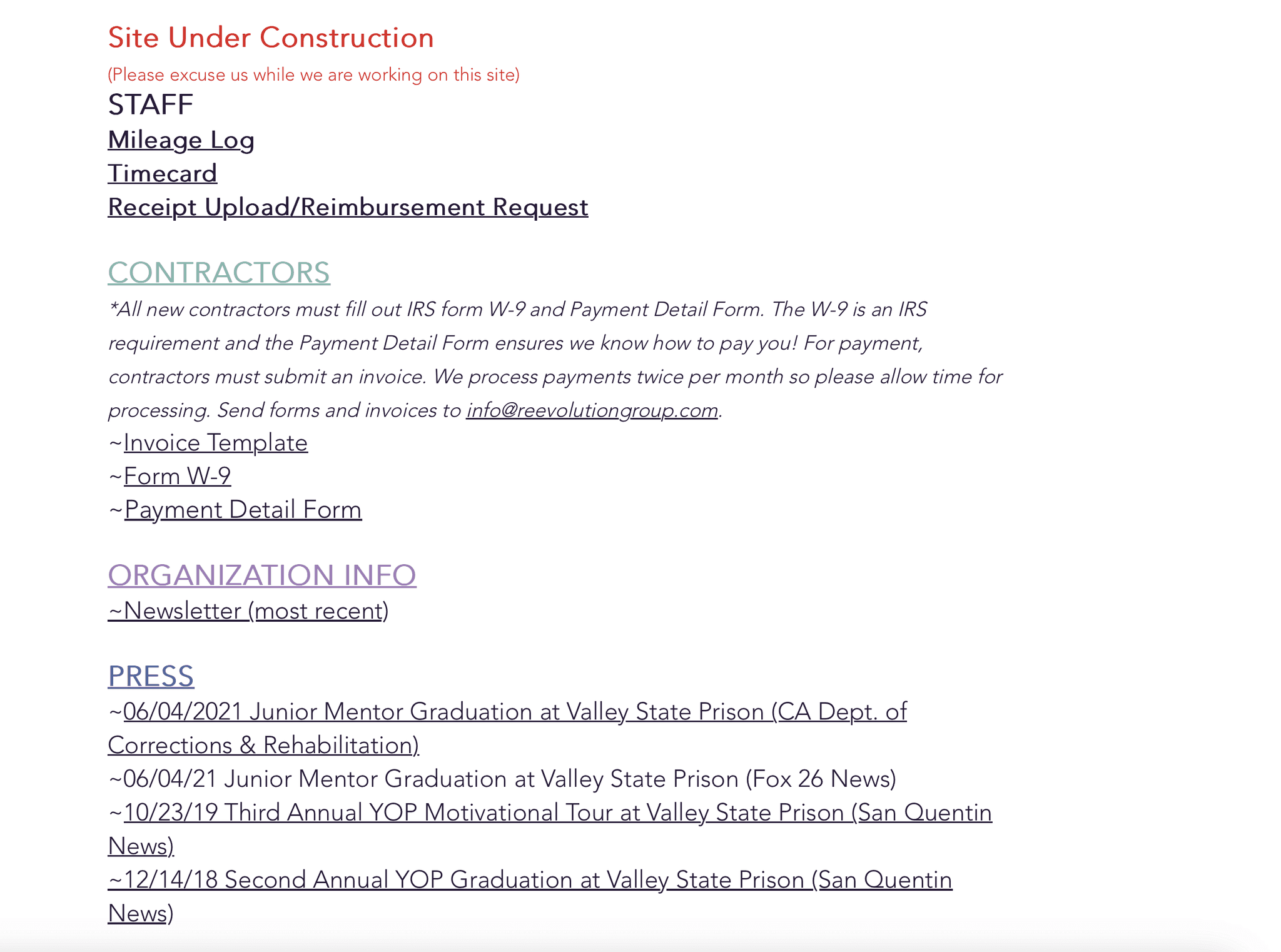
While ReEvolution has played an integral role in carceral reform and reentry justice since 2019, their previous website failed to provide essential, current information, did not speak to a clear audience and displayed broken navigation, leading users to be unclear whether the organization was still active.
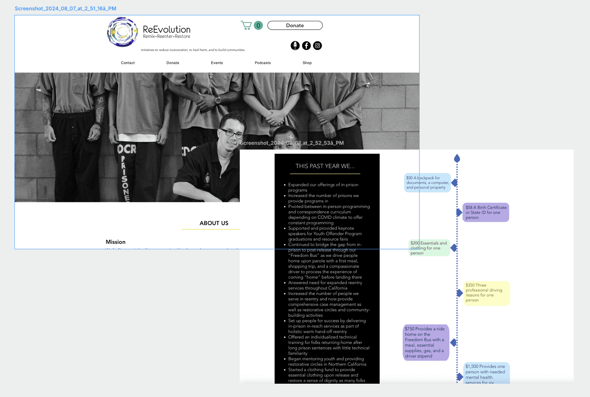
Like other non profit organizations, ReEvolution relies on an array of contributions, gifts and grants in order to continue their work on carceral justice and post-carceral reform, making a strong and dynamic platform, a key factor of long term non-profit success that this organization was not previously benefiting from.
Upon discovering these inconsistencies, we reached out to ReEvolution’s founder in order to gather further information we needed to proceed with the proposed design as well as gain insight as to how a redesign would best impact the needs and struggles of their organization in order to further their mission.
She provided us with details and the context needed to understand the scope of work they do, the oversight and history related to funding, thus providing us the opportunity to best highlight the organization's impact on California's community impacted by the carceral system.
Although they have grown in the past the five years, they have struggled to expand their donation sources and reach the level of funding needed to expand programming, the founder explained. In order to meet their target goals of growth and development and accomplish some of the organization’s ambitions, which include creating a transitional living home for the recently incarcerated. A space of safety, guidance, healing and communal support to set individuals up for their best chance at a successful, stable reentry. Secondary needs mentioned in our conversation with our potential stakeholder included communication with and maintaining community.
Visual Reports
Open Lines of
Communication
Accessible Forms
PHASE THREE
Ideation
User Research
In order to further our research, we sent out a survey and conducted one-on-one interviews. The data allowed us to realize our potential users, ensuring a user-centric approach as we move into the design phase.
Our survey received over fifty respondents, defining what they want from a nonprofit organization. We found that individuals were motivated by causes that resonate with them on a personal level. Reputation and impact of the organization also play a key role in influencing an individual to attach themselves to a cause or particular organization. The survey results emphasized the importance of an organization’s financial transparency and the opportunities for impact that both they are striving to fulfill and how outside support would be utilized. Survey respondents overwhelmingly agreed that an important factor in their decision to contribute to a particular cause, is the experience of seamlessly donating to, or volunteering for an organization.

We learned what is expected of a transparent, trustworth and authentic organization; key language found consistently in our research. The principal information gleaned from this stage in the process included the need for an obvious trail of the money. Where, and how funding was allocated were of vital importance across the board.
What They Said
“What percentage of my donation actually goes toward the end user?”
“Does the organization really contribute to the common good?”
“Who are you actually helping?”
“Does my contribution make an impact to benefit the community?”
A second consistent need of a “good organization” found in our data was a distinct social presence. This included a visible display of the organization at work with the community and an easy way to connect with and receive a timely response from the organization. Knowing that the organization was positive and expeditious in their response suggests to potential users that the nonprofit is organized, efficient and cares about the outside support they may receive, whether that be from donors or volunteers.
The third reported factor of a nonprofit organization taken under consideration for this redesign was for the organization to show growth and development. In order to positively reflect the work the organization was doing, it was important, according to our users, to display how the organization had evolved since inception. What were their accomplishments as well as their struggles? What were their goals and ambitions for the future? Users wanted to know that their support would leave a lasting impact. For us this meant finding a way to display how donations and forms of social engagement could assist in ReEvolution meeting both long and short term goals.
These responses provided us with enough background to define our broad design objectives. Our redesign needed to detail, disclose and emote the missions, enhance visual consistency across multiple pages and platforms and limit user friction in completing essential tasks.

Design Objectives
Detailed organization history, mission and financials
Cohesion through design consistency
Minimize user friction on essential tasks
Content Audit
While completing a content audit of the existing ReEvolution website, we found several key shortcomings, the largest being the fragmented, incomplete status of the design. The design and messaging was inconsistent across pages, information architecture follows few principles, creating disorganization and confusion while trying to navigate the site. For users interested in the organization, there are limited ways to get involved with the organization or use its services.

Status
Visual design elements were inconsistent
Site pages were incomplete/dead-ends
Organization’s messaging failed to deliver
In an approach to address these shortcomings, we revised the current website’s sitemap using the information discovered through the previous stages of our research. We defined our users to fall into three distinct categories; donors, volunteers and community members looking to utilize reEvolution's services. These groupings would reflect the organization of our user flow and the layout of the site’s new design.
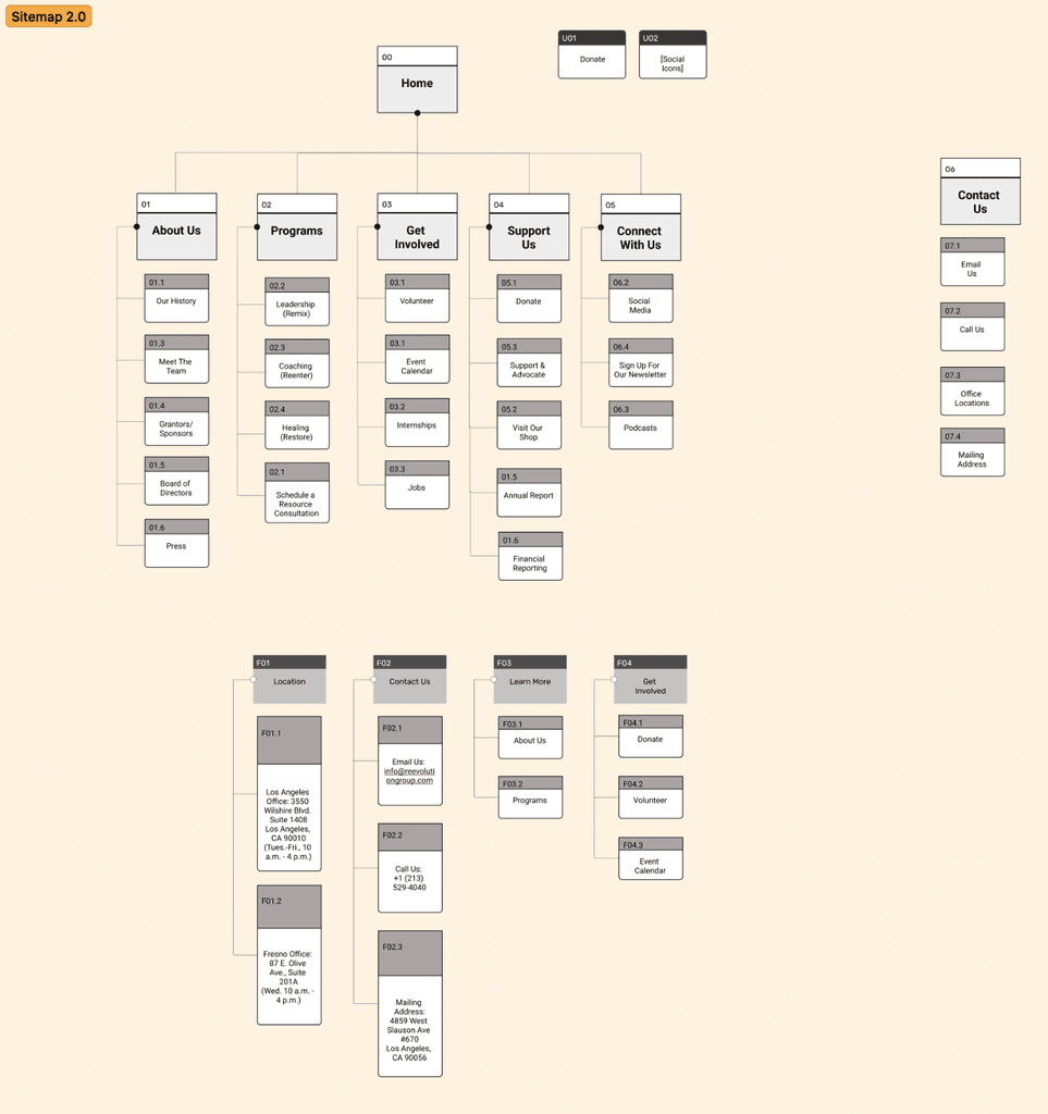
We then tested our proposed layout by conducting three rounds of card sorting before landing on a new consistent design of the organization’s navigation. Had we not been under such rigid time constraints, we would not have been so limited in our testing. We feel that further rounds of secondary navigation and a/b testing of our early format would have benefited the overall feel of the site across platforms.
PHASE FOUR
Define & Synthesize
Following our research we looked at our data as a whole, creating a visual outline of trends in the responses we received and within the sites of comparative organizations. Laying out the data in a visual display allowed us to pick out key information that helped us to better understand potential user types, identify possible pain points commonly found on non-profit platforms and currently encountered on the ReEvolution website and explore potential opportunities to resolve user needs and pain points as well as brainstorm areas to innovate and play.
USER TYPES
Clients
Donors
Volunteers
Knowing who we were designing for allowed us to effectively map out various possible scenarios when encountering the site. By Identifying potential donors, from volunteers or those looking to utilize their services we could approach each journey as distinct and each would require its own set of interactions, while keeping in mind that the tone would need to remain consistent.
By synthesizing the information we could begin to consider not only what is expected of the the platform with regards to content, but the ways in which it should feel in order to effectively and emotionally draw users into the organization’s mission, done in a way that bridges any gaps in human experience, inviting an urgency to engage with and connect to the work they are doing. The trends picked out from the data became the driving principles for the design.
Organization: Follows principles of information architecture that allows simple navigation and well placed information.
Consistency: Pages display consistency in their design layout, color and form and the content is delivered on brand with the organization’s identity.
Community: The platform offers clear lines of communication and involvement.
Tangible Impact: They show the visual results of their efforts.
Transparency: An open, visual display and statistical callouts that show financial and institution/management transparency.
PHASE FIVE
Design
Early Design & Interactions
Equipped with research and our basic navigation we began by creating paper prototypes, followed quickly by low fidelity wireframes. In order to refine these early concepts we held rapid testing usability studies. Conducting as many tests as possible through each iteration of our prototype was key to our working as a team, under the clock.
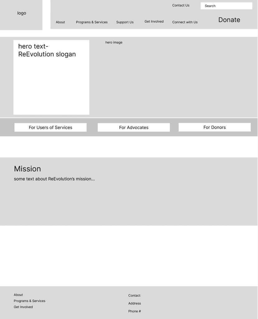
Detailed research early on along with iterative testing allowed us, as a team, to align our differences in design and make sure we continued to meet the needs of our users, as our designs progressed and the content became flushed out.
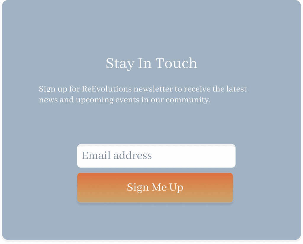
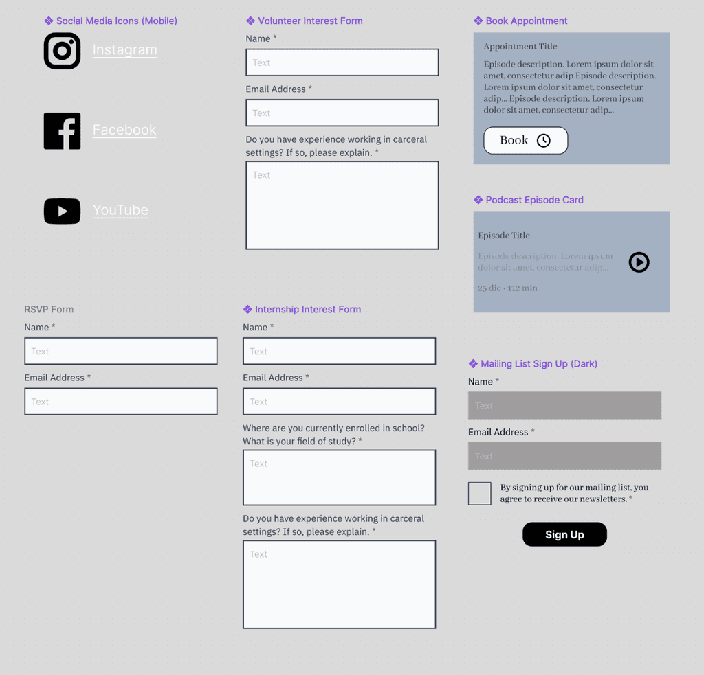
Based on our content audit and discussions with the founder, for this small organization, running on limited funds, our work would need to attempt to bypass the limited resources they have in order to streamline communication that could happen on their platform. This would manifest in our project in a series of ways that allow various opportunities for people to sign up, and connect with the ReEvolution community.
The Process
By expanding forms and details related to communication and offering friendly ReEvolution signature forms of confirmation, we hoped to create an anticipatory line of contact and showcase the receptive and sociable nature of the organization’s staff that may be missed or lost through response times and missing information previously encountered on their site.
Through multiple rounds of testing, we were able to fine-tune our design, moving inward from large scale changes in navigation and formatting, to smaller adjustments in sizing, language and color accessibility. Thus assuring our users clarity, and ease of use. These alterations resulted in a more cohesive, full design.

By addressing the information architecture early on in our design process, we were better able to understand how people classify information, allowing us to evolve and clarify vital components of our design.
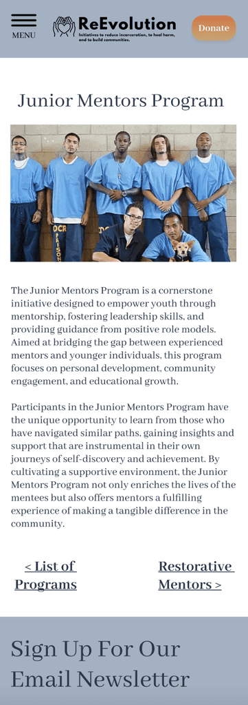
Our team adapted to reflect our users' assessments of our design. Utilizing larger imagery and by adding key text information, users were able to locate crucial material that would result in more conclusive decisions and ultimately a greater number of task completion.
Delivery
I see this final stage as a moment for us, as team members on this redesign project, to converge and showcase the work we have accomplished, and learn from the designs and questions asked of our teammates. By coming together, we aim to eliminate ambiguity in our process, clarified by organized documentation of each touchstone of our process as a group. Through organized Figma materials, documented communications and visual displays, all of which offer a glimpse into our ambitions and outcomes of our evolving redesign.
PHASE SIX
Conclusion
Future
Given the constraints of this project, the redesign is an ongoing process in collaboration with the Los Angeles based organization. Backed with the research gleaned and ready to refine, our stakeholders are eager to move forward in partnership with our proposed redesign in the coming months.
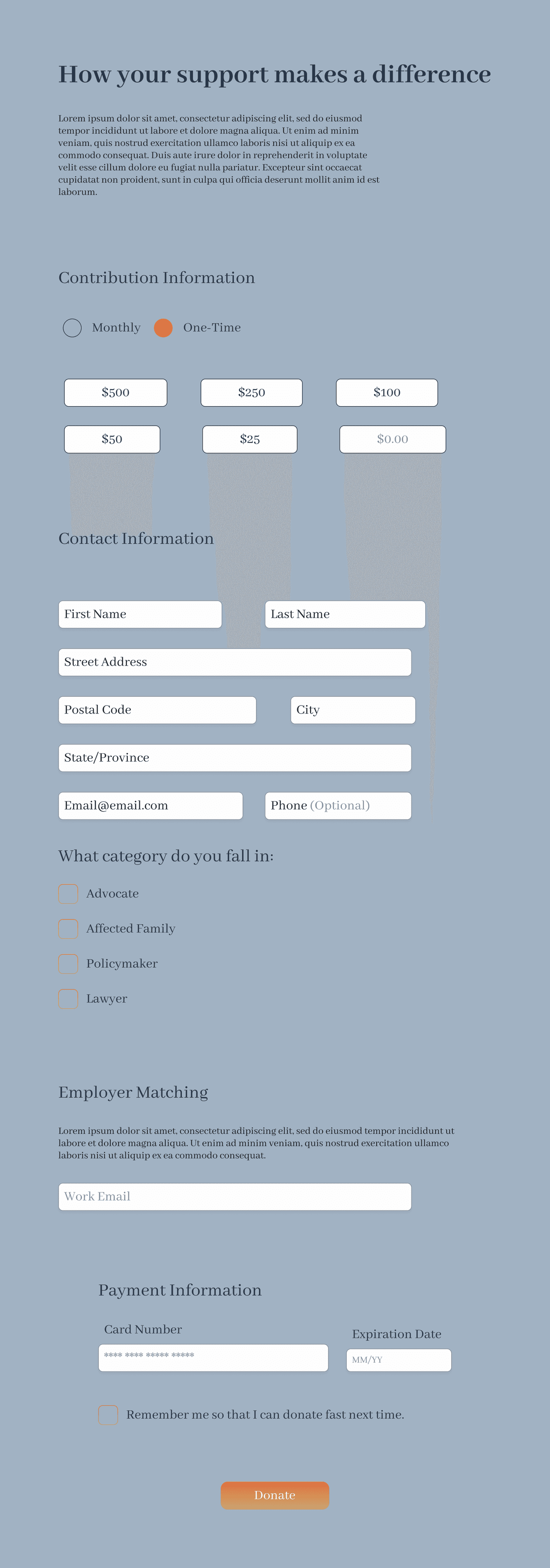
Based on our own findings within the scope of our project deadline, we see opportunity for further testing, specifically on donation pages and ways to best maintain current relevant information pertaining to donation opportunities as a main feature.
As ReEvolution adopts our platform alterations and evolves as an organization, I look forward to the opportunity to play a role in the ongoing development of their website, thus in part having a small role in the greater positive impact ReEvolution is having on carceral reform and reentry justice.
Bringing A New Face To A Young Non Profit
In this case study, I connected with community activists at Los Angeles based ReEvolution, to assist them in their mission, by redesigning their charity’s website.
Discover how I improved visual continuity, emphasized vital content to key user types and streamlined their use and engagement with such information.


MY CONTRIBUTIONS
User Research,
Design & Testing


TIMELINE
April 1-April 22 2024


THE TEAM
2 Designers working simultaneously
PHASE ONE
As part of the Northwestern Ux/Ui Bootcamp, we were tasked with the redesign of a nonprofit organization of our choosing. With just three weeks to conduct research, develop, test, create, iterate and summarize our design solutions, this redesign would test our ability to work cohesively and expeditiously as a team intent on producing a design that reflected the respect I have for the work being done by the organization.
Overview
For this case study, I connected with community activists at Los Angeles based ReEvolution, to assist them in their mission, by redesigning their charity’s website. Discover how I improved visual continuity, emphasized vital content to key user types and streamlined their use and engagement with such information.
ReEvolution is a Los Angeles based anti recidivism organization working to empower and heal, currently and recently incarcerated individuals and their families through programing and comprehensive services that aim to create an individualized framework of reentry built on community and restorative practices.


Constraints
Time constraints.
Limited resources.
Communication with the organization in order to best meet their vision and goals for a future platform redesign.
Given these challenges, we leveraged preliminary research of our competitors and a sample survey that we put together in order to understand the core needs of any non-profit site early on. This would allow us to lay a strong foundation of our redesign of a previously bare-bones site, allowing us more time in our iterative process to answer the question of what design choices can we make that would allow a deeper connection to ReEvolution’s mission and allow them to evolve as an organization.
California has an incarceration rate of 549 per 100,000 people ( this includes jails, prisons, juvenile and immigration detention facilities), one of the highest rates of any state in the U.S. Although trending downward, due to changes in law and municipal regulations on policing, the rate of reincarceration remains high.
PHASE TWO
Discovery
While ReEvolution has played an integral role in carceral reform and reentry justice since 2019, their previous website failed to provide essential, current information, did not speak to a clear audience and displayed broken navigation, leading users to be unclear whether the organization was still active.


Like other non profit organizations, ReEvolution relies on an array of contributions, gifts and grants in order to continue their work on carceral justice and post-carceral reform, making a strong and dynamic platform, a key factor of long term non-profit success that this organization was not previously benefiting from.
Upon discovering these inconsistencies, we reached out to ReEvolution’s founder in order to gather further information we needed to proceed with the proposed design as well as gain insight as to how a redesign would best impact the needs and struggles of their organization in order to further their mission.
She provided us with details and the context needed to understand the scope of work they do, the oversight and history related to funding, thus providing us the opportunity to best highlight the organization's impact on California's community impacted by the carceral system.
Although they have grown in the past the five years, they have struggled to expand their donation sources and reach the level of funding needed to expand programming, the founder explained. In order to meet their target goals of growth and development and accomplish some of the organization’s ambitions, which include creating a transitional living home for the recently incarcerated. A space of safety, guidance, healing and communal support to set individuals up for their best chance at a successful, stable reentry. Secondary needs mentioned in our conversation with our potential stakeholder included communication with and maintaining community.
Visual Reports
Open Lines of
Communication
Accessible Forms
PHASE THREE
Ideation
User Research
In order to further our research, we sent out a survey and conducted one-on-one interviews. The data allowed us to realize our potential users, ensuring a user-centric approach as we move into the design phase.
Our survey received over fifty respondents, defining what they want from a nonprofit organization. We found that individuals were motivated by causes that resonate with them on a personal level. Reputation and impact of the organization also play a key role in influencing an individual to attach themselves to a cause or particular organization. The survey results emphasized the importance of an organization’s financial transparency and the opportunities for impact that both they are striving to fulfill and how outside support would be utilized. Survey respondents overwhelmingly agreed that an important factor in their decision to contribute to a particular cause, is the experience of seamlessly donating to, or volunteering for an organization.
We learned what is expected of a transparent, trustworth and authentic organization; key language found consistently in our research. The principal information gleaned from this stage in the process included the need for an obvious trail of the money. Where, and how funding was allocated were of vital importance across the board.
What They Said
“What percentage of my donation actually goes toward the end user?”
“Does the organization really contribute to the common good?”
“Who are you actually helping?”
“Does my contribution make an impact to benefit the community?”
A second consistent need of a “good organization” found in our data was a distinct social presence. This included a visible display of the organization at work with the community and an easy way to connect with and receive a timely response from the organization. Knowing that the organization was positive and expeditious in their response suggests to potential users that the nonprofit is organized, efficient and cares about the outside support they may receive, whether that be from donors or volunteers.
The third reported factor of a nonprofit organization taken under consideration for this redesign was for the organization to show growth and development. In order to positively reflect the work the organization was doing, it was important, according to our users, to display how the organization had evolved since inception. What were their accomplishments as well as their struggles? What were their goals and ambitions for the future? Users wanted to know that their support would leave a lasting impact. For us this meant finding a way to display how donations and forms of social engagement could assist in ReEvolution meeting both long and short term goals.
These responses provided us with enough background to define our broad design objectives. Our redesign needed to detail, disclose and emote the missions, enhance visual consistency across multiple pages and platforms and limit user friction in completing essential tasks.


Design Objectives
Detailed organization history, mission and financials
Cohesion through design consistency
Minimize user friction on essential tasks
Content Audit
While completing a content audit of the existing ReEvolution website, we found several key shortcomings, the largest being the fragmented, incomplete status of the design. The design and messaging was inconsistent across pages, information architecture follows few principles, creating disorganization and confusion while trying to navigate the site. For users interested in the organization, there are limited ways to get involved with the organization or use its services.


Status
Visual design elements were inconsistent
Site pages were incomplete/dead-ends
Organization’s messaging failed to deliver
In an approach to address these shortcomings, we revised the current website’s sitemap using the information discovered through the previous stages of our research. We defined our users to fall into three distinct categories; donors, volunteers and community members looking to utilize reEvolution's services. These groupings would reflect the organization of our user flow and the layout of the site’s new design.
We then tested our proposed layout by conducting three rounds of card sorting before landing on a new consistent design of the organization’s navigation. Had we not been under such rigid time constraints, we would not have been so limited in our testing. We feel that further rounds of secondary navigation and a/b testing of our early format would have benefited the overall feel of the site across platforms.


PHASE FOUR
Define & Synthesize
Following our research we looked at our data as a whole, creating a visual outline of trends in the responses we received and within the sites of comparative organizations. Laying out the data in a visual display allowed us to pick out key information that helped us to better understand potential user types, identify possible pain points commonly found on non-profit platforms and currently encountered on the ReEvolution website and explore potential opportunities to resolve user needs and pain points as well as brainstorm areas to innovate and play.
USER TYPES
Clients
Donors
Volunteers
Knowing who we were designing for allowed us to effectively map out various possible scenarios when encountering the site. By Identifying potential donors, from volunteers or those looking to utilize their services we could approach each journey as distinct and each would require its own set of interactions, while keeping in mind that the tone would need to remain consistent.
By synthesizing the information we could begin to consider not only what is expected of the the platform with regards to content, but the ways in which it should feel in order to effectively and emotionally draw users into the organization’s mission, done in a way that bridges any gaps in human experience, inviting an urgency to engage with and connect to the work they are doing. The trends picked out from the data became the driving principles for the design.
Organization: Follows principles of information architecture that allows simple navigation and well placed information.
Consistency: Pages display consistency in their design layout, color and form and the content is delivered on brand with the organization’s identity.
Community: The platform offers clear lines of communication and involvement.
Tangible Impact: They show the visual results of their efforts.
Transparency: An open, visual display and statistical callouts that show financial and institution/management transparency.
PHASE FIVE
Design
Early Design & interactions
Equipped with research and our basic navigation we began by creating paper prototypes, followed quickly by low fidelity wireframes. In order to refine these early concepts we held rapid testing usability studies. Conducting as many tests as possible through each iteration of our prototype was key to our working as a team, under the clock.


Detailed research early on along with iterative testing allowed us, as a team, to align our differences in design and make sure we continued to meet the needs of our users, as our designs progressed and the content became flushed out.
Based on our content audit and discussions with the founder, for this small organization, running on limited funds, our work would need to attempt to bypass the limited resources they have in order to streamline communication that could happen on their platform. This would manifest in our project in a series of ways that allow various opportunities for people to sign up, and connect with the ReEvolution community.


The Process
By expanding forms and details related to communication and offering friendly ReEvolution signature forms of confirmation, we hoped to create an anticipatory line of contact and showcase the receptive and sociable nature of the organization’s staff that may be missed or lost through response times and missing information previously encountered on their site.
Through multiple rounds of testing, we were able to fine-tune our design, moving inward from large scale changes in navigation and formatting, to smaller adjustments in sizing, language and color accessibility. Thus assuring our users clarity, and ease of use. These alterations resulted in a more cohesive, full design.


By addressing the information architecture early on in our design process, we were better able to understand how people classify information, allowing us to evolve and clarify vital components of our design.
Our team adapted to reflect our users' assessments of our design. Utilizing larger imagery and by adding key text information, users were able to locate crucial material that would result in more conclusive decisions and ultimately a greater number of task completion.
Delivery
I see this final stage as a moment for us, as team members on this redesign project, to converge and showcase the work we have accomplished, and learn from the designs and questions asked of our teammates. By coming together, we aim to eliminate ambiguity in our process, clarified by organized documentation of each touchstone of our process as a group. Through organized Figma materials, documented communications and visual displays, all of which offer a glimpse into our ambitions and outcomes of our evolving redesign.


PHASE SIX
Conclusion
Future
Given the constraints of this project, the redesign is an ongoing process in collaboration with the Los Angeles based organization. Backed with the research gleaned and ready to refine, our stakeholders are eager to move forward in partnership with our proposed redesign in the coming months.
Based on our own findings within the scope of our project deadline, we see opportunity for further testing, specifically on donation pages and ways to best maintain current relevant information pertaining to donation opportunities as a main feature.
As ReEvolution adopts our platform alterations and evolves as an organization, I look forward to the opportunity to play a role in the ongoing development of their website, thus in part having a small role in the greater positive impact ReEvolution is having on carceral reform and reentry justice.
Bringing A New Face To A Young Non Profit
In this case study, I connected with community activists at Los Angeles based ReEvolution, to assist them in their mission, by redesigning their charity’s website.
Discover how I improved visual continuity, emphasized vital content to key user types and streamlined their use and engagement with such information.


THE TEAM
2 Designers working simultaneously


TIMELINE
April 1-April 22 2024


MY CONTRIBUTIONS
User Research,
Design & Testing
PHASE ONE
As part of the Northwestern Ux/Ui Bootcamp, we were tasked with the redesign of a nonprofit organization of our choosing. With just three weeks to conduct research, develop, test, create, iterate and summarize our design solutions, this redesign would test our ability to work cohesively and expeditiously as a team intent on producing a design that reflected the respect I have for the work being done by the organization.
For this case study, I connected with community activists at Los Angeles based ReEvolution, to assist them in their mission, by redesigning their charity’s website. Discover how I improved visual continuity, emphasized vital content to key user types and streamlined their use and engagement with such information.
ReEvolution is a Los Angeles based anti recidivism organization working to empower and heal, currently and recently incarcerated individuals and their families through programing and comprehensive services that aim to create an individualized framework of reentry built on community and restorative practices.


Constraints
Time constraints.
Limited resources.
Communication with the organization to best meet their vision & goals for a future platform redesign.
Given these challenges, we leveraged preliminary research of our competitors and a sample survey that we put together in order to understand the core needs of any non-profit site early on. This would allow us to lay a strong foundation of our redesign of a previously bare-bones site, allowing us more time in our iterative process to answer the question of what design choices can we make that would allow a deeper connection to ReEvolution’s mission and allow them to evolve as an organization.
California has an incarceration rate of 549 per 100,000 people ( this includes jails, prisons, juvenile and immigration detention facilities), one of the highest rates of any state in the U.S. Although trending downward, due to changes in law and municipal regulations on policing, the rate of reincarceration remains high.
PHASE TWO
Discovery
While ReEvolution has played an integral role in carceral reform and reentry justice since 2019, their previous website failed to provide essential, current information, did not speak to a clear audience and displayed broken navigation, leading users to be unclear whether the organization was still active.


Like other non profit organizations, ReEvolution relies on an array of contributions, gifts and grants in order to continue their work on carceral justice and post-carceral reform, making a strong and dynamic platform, a key factor of long term non-profit success that this organization was not previously benefiting from.
Upon discovering these inconsistencies, we reached out to ReEvolution’s founder in order to gather further information we needed to proceed with the proposed design as well as gain insight as to how a redesign would best impact the needs and struggles of their organization in order to further their mission.
She provided us with details and the context needed to understand the scope of work they do, the oversight and history related to funding, thus providing us the opportunity to best highlight the organization's impact on California's community impacted by the carceral system.
Although they have grown in the past the five years, they have struggled to expand their donation sources and reach the level of funding needed to expand programming, the founder explained. In order to meet their target goals of growth and development and accomplish some of the organization’s ambitions, which include creating a transitional living home for the recently incarcerated. A space of safety, guidance, healing and communal support to set individuals up for their best chance at a successful, stable reentry. Secondary needs mentioned in our conversation with our potential stakeholder included communication with and maintaining community.
Visual Reports
Open Lines of
Communication
Accessible Forms
PHASE THREE
IDEATION
User Research
In order to further our research, we sent out a survey and conducted one-on-one interviews. The data allowed us to realize our potential users, ensuring a user-centric approach as we move into the design phase.
Our survey received over fifty respondents, defining what they want from a nonprofit organization. We found that individuals were motivated by causes that resonate with them on a personal level. Reputation and impact of the organization also play a key role in influencing an individual to attach themselves to a cause or particular organization. The survey results emphasized the importance of an organization’s financial transparency and the opportunities for impact that both they are striving to fulfill and how outside support would be utilized. Survey respondents overwhelmingly agreed that an important factor in their decision to contribute to a particular cause, is the experience of seamlessly donating to, or volunteering for an organization.
We learned what is expected of a transparent, trustworth and authentic organization; key language found consistently in our research. The principal information gleaned from this stage in the process included the need for an obvious trail of the money. Where, and how funding was allocated were of vital importance across the board.
What They Said,
“What percentage of my donation actually goes toward the end user?”
“Does the organization really contribute to the common good?”
“Who are you actually helping?”
“Does my contribution make an impact to benefit the community?”
A second consistent need of a “good organization” found in our data was a distinct social presence. This included a visible display of the organization at work with the community and an easy way to connect with and receive a timely response from the organization. Knowing that the organization was positive and expeditious in their response suggests to potential users that the nonprofit is organized, efficient and cares about the outside support they may receive, whether that be from donors or volunteers.
The third reported factor of a nonprofit organization taken under consideration for this redesign was for the organization to show growth and development. In order to positively reflect the work the organization was doing, it was important, according to our users, to display how the organization had evolved since inception. What were their accomplishments as well as their struggles? What were their goals and ambitions for the future? Users wanted to know that their support would leave a lasting impact. For us this meant finding a way to display how donations and forms of social engagement could assist in ReEvolution meeting both long and short term goals.
These responses provided us with enough background to define our broad design objectives. Our redesign needed to detail, disclose and emote the missions, enhance visual consistency across multiple pages and platforms and limit user friction in completing essential tasks.


Design Objectives
Detailed organization
History, mission and financials
Cohesion through design consistency
Minimize user friction on essential tasks
Content Audit
While completing a content audit of the existing ReEvolution website, we found several key shortcomings, the largest being the fragmented, incomplete status of the design. The design and messaging was inconsistent across pages, information architecture follows few principles, creating disorganization and confusion while trying to navigate the site. For users interested in the organization, there are limited ways to get involved with the organization or use its services.


Status
Visual design elements were inconsistent
Site pages were incomplete/dead-ends
Organization’s messaging failed to deliver
In an approach to address these shortcomings, we revised the current website’s sitemap using the information discovered through the previous stages of our research. We defined our users to fall into three distinct categories; donors, volunteers and community members looking to utilize reEvolution's services. These groupings would reflect the organization of our user flow and the layout of the site’s new design.
We then tested our proposed layout by conducting three rounds of card sorting before landing on a new consistent design of the organization’s navigation. Had we not been under such rigid time constraints, we would not have been so limited in our testing. We feel that further rounds of secondary navigation and a/b testing of our early format would have benefited the overall feel of the site across platforms.


PHASE FOUR
DEFINE & SYNTHESIZE
Following our research we looked at our data as a whole, creating a visual outline of trends in the responses we received and within the sites of comparative organizations. Laying out the data in a visual display allowed us to pick out key information that helped us to better understand potential user types, identify possible pain points commonly found on non-profit platforms and currently encountered on the ReEvolution website and explore potential opportunities to resolve user needs and pain points as well as brainstorm areas to innovate and play.
USER TYPES
Clients
Donors
Volunteers
Knowing who we were designing for allowed us to effectively map out various possible scenarios when encountering the site. By Identifying potential donors, from volunteers or those looking to utilize their services we could approach each journey as distinct and each would require its own set of interactions, while keeping in mind that the tone would need to remain consistent.
By synthesizing the information we could begin to consider not only what is expected of the the platform with regards to content, but the ways in which it should feel in order to effectively and emotionally draw users into the organization’s mission, done in a way that bridges any gaps in human experience, inviting an urgency to engage with and connect to the work they are doing. The trends picked out from the data became the driving principles for the design.
Organization: Follows principles of information architecture that allows simple navigation and well placed information.
Consistency: Pages display consistency in their design layout, color and form and the content is delivered on brand with the organization’s identity.
Community: The platform offers clear lines of communication and involvement.
Tangible Impact: They show the visual results of their efforts.
Transparency: An open, visual display and statistical callouts that show financial and institution/management transparency.
PHASE FIVE
Design
Early Design & interactions
Equipped with research and our basic navigation we began by creating paper prototypes, followed quickly by low fidelity wireframes. In order to refine these early concepts we held rapid testing usability studies. Conducting as many tests as possible through each iteration of our prototype was key to our working as a team, under the clock.
Detailed research early on along with iterative testing allowed us, as a team, to align our differences in design and make sure we continued to meet the needs of our users, as our designs progressed and the content became flushed out.
Based on our content audit and discussions with the founder, for this small organization, running on limited funds, our work would need to attempt to bypass the limited resources they have in order to streamline communication that could happen on their platform. This would manifest in our project in a series of ways that allow various opportunities for people to sign up, and connect with the ReEvolution community.


By expanding forms and details related to communication and offering friendly ReEvolution signature forms of confirmation, we hoped to create an anticipatory line of contact and showcase the receptive and sociable nature of the organization’s staff that may be missed or lost through response times and missing information previously encountered on their site.


Through multiple rounds of testing, we were able to fine-tune our design, moving inward from large scale changes in navigation and formatting, to smaller adjustments in sizing, language and color accessibility. Thus assuring our users clarity, and ease of use. These alterations resulted in a more cohesive, full design.


By addressing the information architecture early on in our design process, we were better able to understand how people classify information, allowing us to evolve and clarify vital components of our design.
Our team adapted to reflect our users' assessments of our design. Utilizing larger imagery and by adding key text information, users were able to locate crucial material that would result in more conclusive decisions and ultimately a greater number of task completion.
Delivery
I see this final stage as a moment for us, as team members on this redesign project, to converge and showcase the work we have accomplished, and learn from the designs and questions asked of our teammates. By coming together, we aim to eliminate ambiguity in our process, clarified by organized documentation of each touchstone of our process as a group. Through organized Figma materials, documented communications and visual displays, all of which offer a glimpse into our ambitions and outcomes of our evolving redesign.


PHASE SIX
CONCLUSION
Future
Given the constraints of this project, the redesign is an ongoing process in collaboration with the Los Angeles based organization. Backed with the research gleaned and ready to refine, our stakeholders are eager to move forward in partnership with our proposed redesign in the coming months.
Based on our own findings within the scope of our project deadline, we see opportunity for further testing, specifically on donation pages and ways to best maintain current relevant information pertaining to donation opportunities as a main feature.
As ReEvolution adopts our platform alterations and evolves as an organization, I look forward to the opportunity to play a role in the ongoing development of their website, thus in part having a small role in the greater positive impact ReEvolution is having on carceral reform and reentry justice.